





Resume Format, Length, and Fonts That Still Work
 August 20, 2026
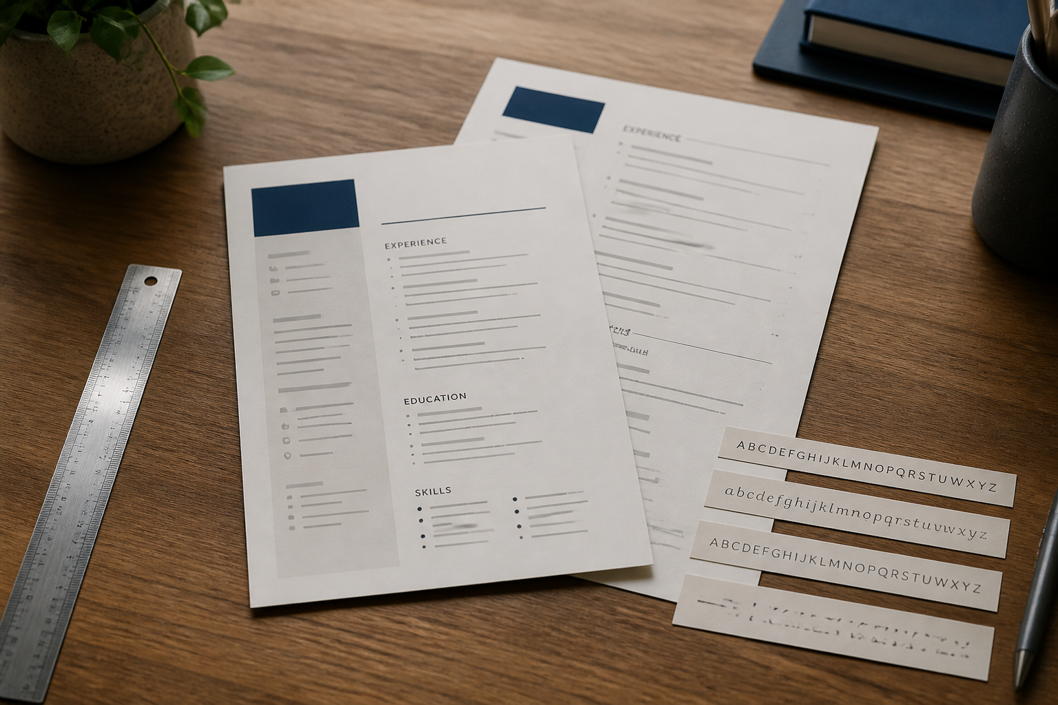
Resume Format, Length, and Fonts That Still Work
Resume design advice on the internet is loud. One page only. Never one page. Infographic resumes. Creative color blocks. Tiny margins so you can keep every bullet. It is a lot of noise for a document that should be easy to read.
Format is not your personality. Format is hospitality. You are making it easy for a tired person to find your name, your recent work, and your proof.
This guide covers layout, length, fonts, file type, and the small alignment details that signal care. You do not need to become a designer. You need a document that behaves.
Start With a Layout a Stranger Can Scan
A resume is scanned, then read. Scanning needs a predictable map.
Put your name first, large enough to see, not so large it looks like a poster.
Put contact details on one or two lines: phone, email, city and region, LinkedIn or portfolio.
Use clear section headings: Summary, Skills, Experience, Education.
Keep experience in reverse chronological order unless you have a strong reason not to.
Align dates consistently, usually on the right.
If someone pinches the page on a phone, they should still see structure. If they print it in black and white, it should still work. Color can be a thin accent. It should not be the only way to tell headings from body text.
One Column Versus Two
A single column is the safest choice for online applications. Text flows in the order a person and a parser expect.
Two columns can look modern. They also cause trouble when the left rail holds dates or skills that get read out of order. If you like a sidebar of skills, test it. Copy the whole resume into a plain text file. If the jobs scramble, simplify.
Creative fields sometimes tolerate more design. Even then, the portfolio does the visual work. The resume still needs to be a clear record of roles and results. A beautiful resume that cannot be parsed by a hospital or a bank portal is a beautiful problem.
How Long Should It Be?
Length is a function of relevant proof, not of pride.
One page is right for many students, career starters, and people with under about eight to ten years of relevant work. One page is also right when the extra page would only add thin duties.
Two pages is normal for experienced professionals with multiple roles, promotions, and results worth keeping. Two pages is not a failure. A weak second page is a failure.
Three pages is rarely useful outside academia, medicine, research, federal applications, or senior technical CVs that are supposed to be long.
If you are at a page and a half, you have a choice: cut to one strong page or fill two pages with work that deserves air. A page and a half with a lonely block at the top of page two often looks unfinished. Either cut or add something that earns the space, such as a second role’s best bullets or a projects section.
How to Cut Without Deleting Your Career
Cutting is editing, not amnesia.
Reduce older roles to two lines.
Remove skills you no longer want to be hired for.
Drop internships once full-time work covers the same ground.
Combine similar part-time jobs.
Shorten the summary.
Delete “references available upon request.”
Keep promotions. Keep results. Keep tools that still matter. The goal is density of signal, not density of ink.
Fonts: Boring Is a Feature
Use a professional, readable font and stay with it. Calibri, Cambria, Georgia, Garamond, Palatino, Arial, Helvetica, and similar workhorses are fine. One font family for the whole document. You can bold headings. You do not need a display font for your name that looks like a wedding invitation.
Body text around 10 to 12 points. Your name a little larger. Headings obvious. Line spacing that does not crush letters together.
Avoid script. Avoid ultra-thin fonts that disappear when printed. Avoid comic or novelty type. This should not need saying, and yet.
If you are unsure, print a page or export to PDF and zoom to 80 percent. If you have to squint, the font is too small or too light.
Margins and White Space
Half-inch margins are about as tight as you should go. Narrower than that looks like you were afraid to edit. Wider margins with little content look like you did not have enough to say.
White space is part of the design. It gives the eye a place to land. A packed page feels anxious. An airy page with strong bullets feels confident.
Keep consistent spacing between sections. Inconsistent gaps look accidental.
Bullets, Not Essays
Most experience should be bullets, not paragraphs. Paragraphs slow scanners. They also hide results in the middle of a sentence.
Use a simple round bullet. Not icons, not arrows in five colors. Start with a verb. Keep most lines to one or two lines, not a paragraph wrapped into a bullet costume.
Two to six bullets per recent role is enough. Older roles can take one to three.
Dates, Locations, and Titles
Write months and years, or years only if you have a reason, but be consistent. “2021 – 2024” next to “March 2019 – Present” looks sloppy.
Use the employer’s real name and your real title. Location can be city and state, or “Remote.” If you relocated, do not create geography confusion. If you are open to relocation, the cover letter or application form is often a better place to say so than a mysterious address.
File Type and File Name
PDF is the default for email and many portals because it preserves layout. If a site demands Word, send Word. Do not send a Google Doc link and hope they request access. Do not send a Pages file.
Name the file like an adult: Jordan-Lee-Resume.pdf. Not resume.pdf, not Final_USE_THIS.pdf, not Scan0001.pdf.
Headers, Footers, Photos, and Graphics
In many U.S. private-sector jobs, skip the photo. Skip charts of your personality. Skip the skill wheel.
A header with your name on page two is useful so a printed second page does not get lost. A footer with “Page 2 of 2” can help. Tiny confidential watermarks are unnecessary.
Icons for phone and email look stylish and sometimes fail accessibility and parsing. Words still work.
Templates: Use Them as a Starting Point, Then Tame Them
A template is fine if you strip the gimmicks. Many popular templates use text boxes, tables, and decorative sidebars that break in applicant tracking systems.
After you fill a template, do the plain-text paste test. Check that headings are real headings, not just colored rectangles. Make sure you can edit dates without fighting the file.
If the template is winning the fight, abandon it. A plain document you control is better than a fashionable one you cannot repair.
Consistency Is the Real Design System
Pick one date format. One bullet style. One heading style. One way to write locations. One tense rule: present tense for the current job, past tense for previous jobs.
Readers may not praise consistency. They notice inconsistency immediately. It reads as haste.
A Practical Standard You Can Reuse
Single column
One or two pages based on relevant proof
One readable font
Clear headings
Strong bullets
PDF unless asked otherwise
A file name with your name in it
That standard will not win a design award. It will survive a recruiter’s phone, a copy-paste into a database, and a printout in a conference room.
The format’s job is to disappear. When it disappears, the work you did can finally be seen. That is the only design brief a resume needs.